Evolution of Digital Design
Design trends swing like a pendulum, flipping between "make it feel real" and "strip out the extras." In the 90s and early 2000s, buttons had to look 3D because people were still learning what to click. By the 2010s, everyone knew the ropes, so designers shaved off the shine and went flat. Shadows and gloss felt stale. Then the 2020s arrived, and pure flat started to feel cold and tricky to use. Soft shadows and frosted glass came back, not to imitate real life, but to make screens feel warmer.
Digital Wilderness
The loud look of 90s websites had a logic. Designers worked with clunky tools. Bandwidth was pricey, so pages stayed tiny. Monitors showed maybe 256 colors, so they cranked up contrast just to be seen. Layouts used HTML tables because CSS barely helped. Want a custom font? You baked the text into an image.
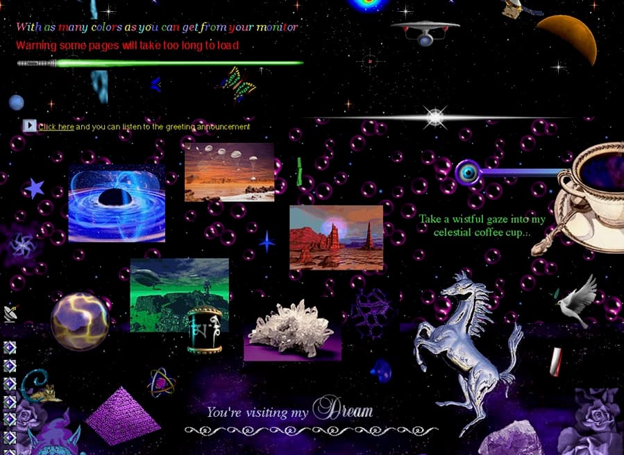
Here's the twist: the worse the tools, the louder the visuals. If polish isn't an option, you show up with energy, spinning GIFs, tiled backgrounds, rainbow dividers. Not accidents, just designers shouting “look at me!” with the gear they had. Digital folk art.
With no rulebook, 90s sites were experiments. Navigation might be a wall of blue links or a chaotic image map. Backgrounds were canvases covered in stars, marble textures, or any pattern that tiled fast. Early skeuomorphic icons, folders that looked like folders, trash cans that looked like trash cans, taught first time mouse users what to click.
Gloss and Interaction
The 2000s traded chaos for polish. Y2K's chrome and neon vibe softened into glossy buttons, gentle gradients, and interfaces that felt touchable. Apple nailed it. The first iPhone icons looked like tiny paintings. Notes had lined paper. iBooks sat on a wooden shelf. Sounds silly now, but it worked, your parents knew what to tap because it resembled stuff they already knew.
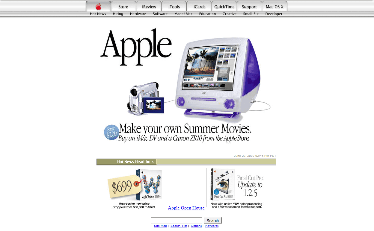
This was the Web 2.0 look: candy gloss buttons, reflective logos, everything gleaming. The style even picked up a name, Frutiger Aero, for its bubbly type and aqua glow.
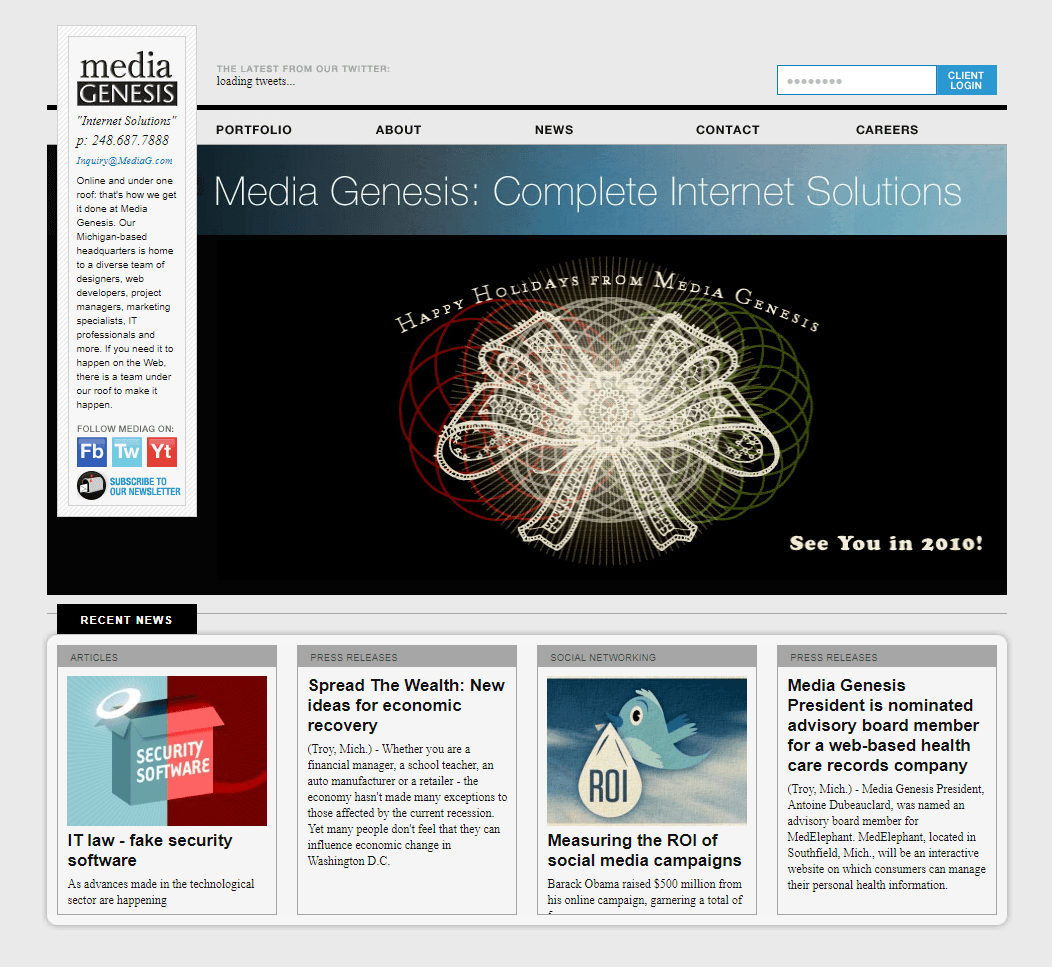
Under the shine, something bigger was changing. Web 2.0 opened the gates so anyone could post, comment, and share. Designers stopped making one off pages and started building systems, templates, CMSes, reusable pieces. The job shifted from “make it pretty” to “make it work no matter what shows up.” That’s when product design took shape.
Flat Wave
Then the iPhone rewrote the rules. By the 2010s, desktops shared space with phones and tablets of every size. Those rich textures took forever to load, scaled weird, and started to feel patronizing. Fake leather to explain a notes app? People didn’t need it.
Designers stripped things down. Microsoft's Metro dropped shadows completely. Apple followed with iOS 7, swapping lush textures for flat colors and thin lines. Google rolled out Material Design, flat, with just enough shadow to hint at what you can tap.
The 2010s put systems ahead of personality. Design felt a lot like engineering: scalable icons, flexible grids, components that worked on watches and TVs alike. Efficient. Consistent. Critics called it soulless. Apps began to blur together.
Return of Humanism
The 2020s welcomed the mess. After a decade of sterile sameness, designers rebelled. Some went brutalist: raw HTML, system fonts, no frills, almost proudly ugly. Others leaned into maximalism with clashing colors and noisy patterns, the visual version of yelling. Everywhere you look, there's a craving for human touches: hand drawn bits, wobbly shapes, type with personality.
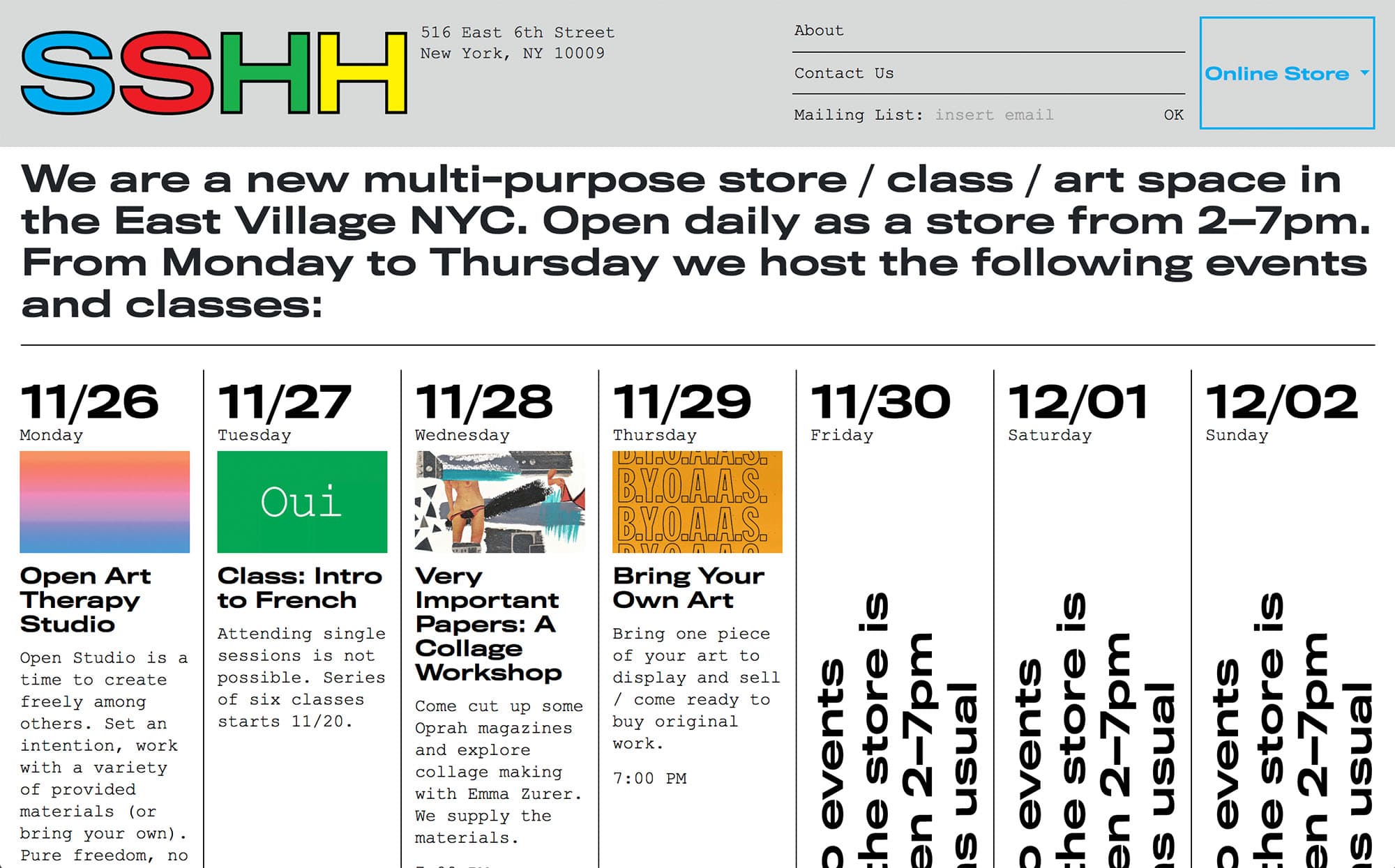
There’s no single “2020s look.” Design splintered into tribes. A crypto startup looks nothing like a sustainable fashion brand or an indie game studio. That’s the point. Design is back to signaling who you are and who you’re for.
The split matches culture. Monoculture's gone. Everyone lives in their own bubble, their own Discord, their own niche. Sites are tribal flags again, like the 90s, except now designers know exactly what they're doing.
What Comes Next
What do thirty years of web design teach us? The pendulum moves because the problems change. The 90s had to explain what a button even was. The 2000s had to make the web feel trustworthy. The 2010s had to work on every screen size. The 2020s had to feel human again. Each era solves one problem and tees up the next.
AR and VR are the obvious next shakeups. When design leaves the flat rectangle for real 3D space, we’ll rewrite the rules again. AI is already changing who designs. If anyone can describe a layout and generate it, the designer’s job leans more on taste, strategy, and asking the right questions.
One thing stays certain: the cycle keeps moving. Tech advances, people adapt, culture shifts, designers respond. The look changes; the rhythm doesn’t. The real question is which problem the 2030s will solve, and which one it will create.